Twenty years ago, Rat City Roller Derby was unleashed onto the world. Our league quickly became a local institution, a national powerhouse, and a global innovator. At the forefront of this movement was a bold and simple logo. Designed by local artist Lord Ego, the black-eyed skater was instantly iconic and perfectly represented our league.
It shows the DIY ethic forged by our founders Rae’s Hell, Hurricane Lilly, and Dixie Dragstrip. It shows the aggression of Basket Casey. It shows the finesse of Luna Negra. It shows the innovation of D-Bomb. It shows the wild frenzy of Rocketman Houllahan. When you see someone wearing a Rat City logo, you know they are just a little cooler than everyone else.

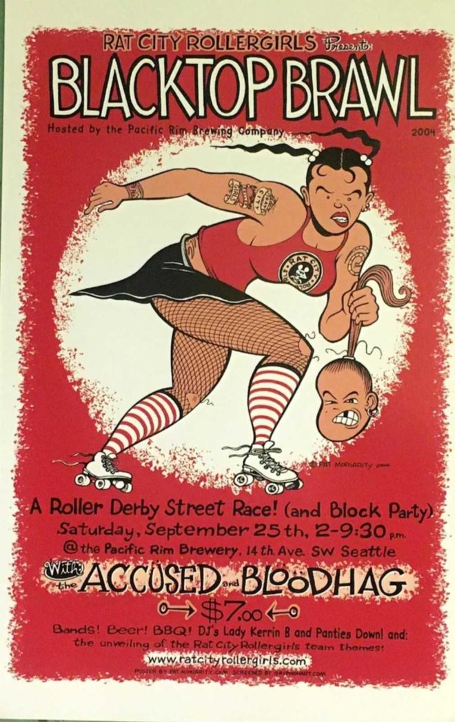
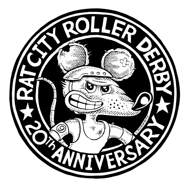
Two decades later we have a special way to blend this amazing heritage with our ever-evolving values and identity. Rat City Roller Derby is proud to share our 20th Anniversary commemorative logo, hand drawn by Pat Moriarty. It is based on his artwork from one of the very first RCRD event posters (the Blacktop Brawl where our home teams debuted) and also features the #9 armband of our beloved Sirius Mischief.

Pat Moriarty Facebook | MoriartyMedia Etsy
Thank you everyone who contributed to twenty years of Rat City Roller Derby. Whether on the track or in the stands, thousands upon thousands of people are responsible for getting us here. Please join as we honor our past and celebrate our future. 2024 is gonna be fun!
